
The ability to transform a car overnight with a full body wrap has created a very lucrative sector of the sign and graphics industry. Pictured: Epson showcased the potential of this sector by wrapping a Fiat for its stand at Sign and Digital UK 2016
Just consider these stats. The internet was used daily or almost daily by 82 percent of adults (41.8m) in Great Britain in 2016, compared with 78 percent (39.3m) in 2015, and 35 percent (16.2m) in 2006. I can just about remember what the internet was like in the year 2000, and its progress is simply astonishing and all-encompassing. No wonder society seems to have changed to where everything needs to be instant when 82 percent of the adult population can simply dismiss your efforts with a click of a button or swipe of a finger and find an alternative—instantly, no second chances, not that you were given a second chance.
Coming back into the UK recently, I was admiring the wayfinding system in the airport as the signs were clear, concise, and in a quantity just right. The Goldilocks of wayfinding you could say.
While I sat waiting for onward transport, I was reminded of the opposite experience I had when out with a BSGA member—taking a brief from a customer who wanted to update the way their business went about advertising itself, specifically on the vehicle fleet. What transpired I later found out was common amongst sign-makers when dealing with small business owners who like to call the shots.
Misguided designs
The main area of contention was the customer’s own graphics design for the vehicle fleet and we were dealing with a rather truculent business owner, who clearly did not get where he was that day by taking ‘no’ for an answer.
How on earth do you rein in a customer who evidently has not got a clue about design principles and the goal of achieving a clear message as well as a pleasing, effective, and informative graphics?
Instead of smart and eye-catching, he wanted to make sure his vans were noticed with flames, a rainbow of colours, and as many different images of his company’s products as could be fitted into every nook and cranny of his fleet of ten LWB Transit vans and five small box van types. ‘That will work won’t it?’
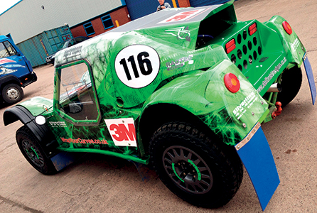
Even on very large canvases, you can have a high-impact and attractive design, but keeping down the number of elements will actually improve the overall effect on applications such as the pictured transport truck
The telephone number should run down the entire length of the vehicle ‘so that it could be seen’. This was on the basis that as he was paying for vinyl to wrap the vehicle, he wanted all the vinyl to be printed and used to get his money’s worth. Understandable, but as far as it goes in the logic department, it is unsound as too much information to be taken in as the Transit van whizzes past you at 75 m.p.h. with an urgent delivery of widgets, simply means that all you remember is that some plonker in a multi-coloured van cut you up. Conversely, stood at traffic lights with so much information to take in quickly leads to boredom and eventual switch off to fiddle with the sat nav/check the mobile or tell the kids in the back seat that ‘No, we are not nearly there yet’.
Simply put, we had to convince the client that he needed to engage with the principle that in limiting the information content to at least the logo, services/products, website, and telephone number, more information can be taken in by the viewer in the short space of time they have (or want) to see the vehicle. By all means have a design that is eye-catching, but try to make sure that it does not detract from the point of advertising the business on the vehicle in the first place, viz, what do you do and how can I contact you? Although they have grown the business from the ground up and are totally immersed in what they see as representing their baby, the point of advertising is to educate in a way that potential customers are attracted to the brand/product followed by a ‘call to action’ i.e. contact the business or buy the product.

By all means have a design that is eye-catching, but try to make sure that it does not detract from the point of advertising the business ”
Not everyone knows who you are, so do not expect instant recognition just from a logo that you have drawn up and plastered on the side of a van. Or, for that matter, an image of your product catalogue instead that can be indecipherable unless you have time to really study the image. I saw an image of a catalogue on a van the other day and believe me, when I finally sussed it was for medical equipment supplies, I knew there was five minutes of my life I would never get back again.
Not everyone knows who you are, so do not expect instant recognition just from a logo that you have drawn up and plastered on the side of a van”
Right direction
Before continuing with this episode, I accept that graphics completely covering a vehicle does work, and in some cases wins awards (cue plug for the BSGA British Sign Awards), but I wager that the final design was down to many attempts and revisions in getting it right. And that process alone demonstrates that it is all about guiding your client in the right direction. This can separate the good designers from the great ones.
Back to the flames and rainbows. My colleague did admit later that she rapidly reached a point during the meeting of conceding. ‘They are paying for it so they can have whatever they want’, but she pulled back from that when she started to get her client’s interest in what she, as a qualified designer and proficient sign-maker, had to offer not just in product but in skill and experience. ‘OK’ she said, ‘you want the phone number to run completely down the side of the van?’ A nod from the client. ‘Let me show you why that may not be your best option’. Classic. Let them know they have been heard but, and this is important, let them know that you genuinely care about their success and the success of this project.
Hand holding
It sometimes is simply not enough to be told why it is not a good idea, people need to see the difference and to demonstrate this, we then spent the next 20 minutes with the customer van spotting on the high street. It was show and tell, and the result was that the sign company got another appointment to come back with suggestions in comparison with what the client wanted in the first place.

It sometimes is simply not enough to be told why it is not a good idea, people need to see the difference ”
I could not attend the second meeting, but was keen to follow up and was not surprised that the sign company won the order which, according to my colleague, was down to the simple fact that her client was really pleased that the presentation offered him more choices than he had thought of himself. Another plus point was the client was able to understand that what may work on a transit sized vehicle, does not necessarily work on a smaller vehicle.
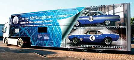
There is little more loud and high-octane than motor racing, but although the colours can shout loud, the information needs to be simple and straightforward to transmit a brand’s message
I was reminded of a photo of a Starbucks van that had the side sliding door open to leave just the logo and the word SUCKS visible. The final design for this client was a toned down version of flames and rainbows, without the flames and rainbows, but somehow managed to ‘wrap’ both types of vehicle with attractive full print graphics and clear information as to who they are, what they do, and details as to how to contact them.
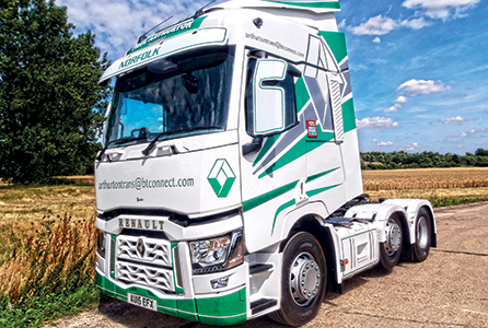
Mobile billboard: A simple web address and an eye-catching design is all your clients really need to improve brand awareness
If only we lived in a world where everything can be perfect from the off and everybody is singing from the same hymn sheet. Reality is though, you cannot win them all and sometimes you have to simply provide exactly what the client demands—and will pay for. I would prefer the satisfaction of at least attempting to engage with the client demonstrating that they are dealing with professionals who care about their business and how it is portrayed out in the big wide world. Always worth the extra endeavour in my book and has, on quite a few occasions, secured more business down the road. Plus, you know in future, you are less likely to be dismissed by a click of a mouse or a swipe of a finger.
Public Notice:
- Advertising should attract customers to the brand/product
- There should always be a call to action on vehicle branding i.e. phone number
- Always show your customer plenty of options
- Repeat business can be secured through showing you care about their goal
The British Sign and Graphics Association (BSGA) history dates back more than 70 years when a group of leading sign-makers formed the Master Sign Makers Association (MSMA) with the aim of promoting the sign industry and defending its interests.
For more information on the issues discussed in this article visit www.bsga.co.uk or tel: 0845 338 3016
Your text here...

