
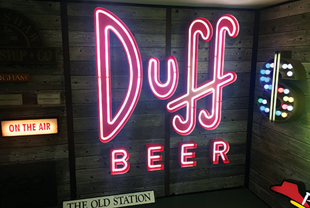
This complex industrial chic signage, with a Steampunk feel to it, was created by ICE Signs for the trendy Gasworks Brew Bar in Manchester and incorporates details such as coated cogs, dials, and scaffolding parts
Fashion is a fickle mistress, constantly changing her guise and taking us all along with her. Always creating new looks or sometimes even revisiting an ‘old’ look and giving it a new twist. Whether in the clothes we wear, the products we buy or graphic design, market forces demand that we keep updated or become outdated. Overnight queues to be among the first to buy a new smartphone or other piece of technology bear witness to just how strongly we can be influenced.
Inevitably this clamour overspills into the sign-making sector, of which sign lettering is a significant element.
The long view
Colin Pestell, director at Gdi Trade Signs reflects on some of the changes that have taken place over the last 40 years.
Gdi Trade Signs’ Gdi Neos offers an eye-catching alternative to exposed neon text and, according to managing director Colin Pestell, is fast becoming the premier alternative to genuine neon
“In 1976 Gdi Trade Signs dwelt in a very different world of signs,” comments Pestell, adding: “We used fluorescent tubes for illuminating sign boxes and neon for illuminating letters. Exposed neon was, and is the most iconic illuminated signage. So much so, that exposed neon is experiencing a considerable resurgence in popularity due to a desire by designers to create a different look for their retail clientele. However, with LEDs being the most popular method of illuminating signs today, an LED option is always going to be in great demand.”

Exposed neon is experiencing a considerable resurgence in popularity due to a desire by designers to create a different look for their retail clientele”
The company’s Gdi Neos offers an eye-catching alternative to exposed neon text. The product has recently been used on several prestige projects to great effect and, according to Pestell, is fast becoming a realistic alternative to genuine neon.
An impressive neon effect created using Gdi Trade Signs’ Gdi Neos, which has recently been used to great effect on several prestige projects
“With its clever use of materials, meticulous attention to detail and unique fabrication methods, it provides a stunning, robust, low voltage option,” Pestell asserts.
Another major issue 40 years ago was mounting illuminated letters and logos onto glass.
“Pre-drilling the glass was the only option,” explains Pestell, continuing: “Although entirely possible, it was very costly and problematic, and was best avoided, if possible.”
With this in mind, Gdi Trax was designed to offer a system that overcame all those problems and at the same time gave a new 21st century look to this age old problem. The Gdi Trax system is designed to enable the installation of built up LED illuminated letters to glass, without the need to drill the glass.
Gdi Trax has been designed by Gdi Trade Signs to enable the installation of built- up LED illuminated letters to glass, without the need to drill the glass
Pestell continues: “Many new and refurbished shopping centres are now insisting on full height glazed store fronts. This gives a wonderful open feel to these sites, but does limit the retailers’ signage options. If you do not want a boring sign box suspended inside the glass or a ‘daisy-chain’ of illuminated letters mounted to the glass and connected with loops of ugly wire, Gdi Trax is the perfect solution. Many shopping centres are now specifying Gdi Trax, as are many retail chains.”
“With high street retailers seeking ever more inventive ways to entice customers into their premises, it is essential for sign-makers to be constantly aware of market trends, and endeavour to offer solutions to the designers’ demands,” summarises Pestell.
On trend
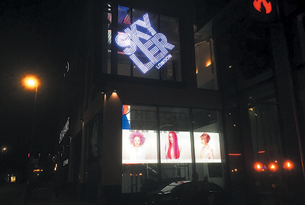
Predictions for 2017 from the graphic design sector at the end of last year included louder, bolder, and brighter colours, moving away from greys, blacks, and muted tones, with Pantone colour ‘Greenery’, ‘a zesty yellow-green’, being hailed as the colour for 2017. Other predictions were strong typography with big daring fonts and mixed font combinations, patterns and geometric shapes, duotones, minimalism, and ‘modern retro’ with a shift to candy colours.
O Factoid: Trend analysis is the rampant practice of collecting information and attempting to spot a pattern. O
Two West Yorkshire-based companies, ICE Signs and Applelec, outline the influences of these predictions and how they have been addressing the demands of these trends.
ICE Signs observes that in recent years the design trend across most media, including décor and fashion, has been an inclination towards minimalist concepts. For example, the clean lines and muted colours of Marks and Spencer’s ‘M&S’ branding with its black and white theme, and modern sans serif font style is one of many brands using this style.
“In this case a fabricated and powder coated aluminium tray is fret-cut and combined with pushed through opal acrylic to illuminate from behind and create a ‘halo’ effect,” says ICE Signs’ managing director, Philip Bairstow.
On the other hand, companies such as ITV are beginning to move towards a more exuberant branding style and ICE Signs has been able to respond by supplying large building signs at their studios nationwide since the first appearance of the current logo in its bright new colours.
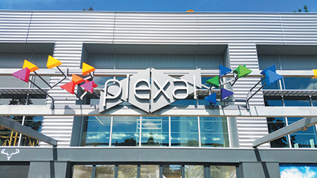
(Above & below) The emergence of geometric shapes is clearly demonstrated by the signage at Plexal, Olympic Park, London, created by ICE Signs. It comprises a series of internally illuminated acrylic prisms mounted onto projecting rods
Bold ‘candy’ colours were also used in the rebranding signage at Broad Street Plaza in Halifax, West Yorkshire, where a sculptural design was manufactured using several layers of built up internally illuminated shapes creating a striking 3D effect logo to complement the new lettering style.
“Interestingly geometric shapes have started to appear within new branding styles such as those at Plexal, Olympic Park, London,” Bairstow observes.
Interestingly geometric shapes have started to appear within new branding styles such as those at Plexal, Olympic Park, London”
ICE Signs was able to fulfil the highly complex brief, which comprised of a series of internally illuminated acrylic prisms of varying colours mounted on rods projecting from the front of the building. The rods, framework and built-up letters were all painted with what the company describes as ‘a revolutionary, ultra-matte, metallic finish paint’.
The industrial theme is demonstrated where ICE Signs has used artificially weathered steel to create an atmospheric store-front
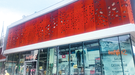
“At the other end of this spectrum we go from modern minimalist to vintage retro,” continues Bairstow, who adds: “Copper and copper effects are bang on trend now and ICE Signs has been receiving an increasing requirement for signage including components with a ‘distressed copper’ finish. The complex industrial chic signage at the uber-trendy Gasworks Brew Bar, Manchester is a good example, with details such as coated cogs, dials, and scaffolding parts.”
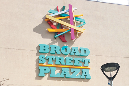
Reflecting the trend towards bold candy colours, this new signage created by ICE Signs for Broad Street Plaza, Halifax used layers of built-up internally illuminated shapes to create the 3D effect logo
The industrial theme is continued in architectural design and signage where steel is artificially weathered. For example, Corten steel has been used by ICE Signs in creating both a high level fascia and an etched monolith.
“This trend is reflected on a smaller scale in the circus lettering that we used at Pizza 900 degrees, where the built-up steel letters have been artificially weathered and are combined with LED cabochon bulbs to create a striking retro style internal sign,”
Bairstow adds. Andy Armitage, head of signage at Applelec concurs: “We are seeing the industrial trend continue with customers looking for signage with a vintage or aged feel,” he affirms, before adding: “An offshoot of the industrial look is the ‘imperfect’ trend, with customers wanting signage that has been engineered to look distressed with features like visible welding joints, cracked paint, and rusted metal. Our metal fabricators have been busy creating some incredible looking signage that uses metal meshing frames with mounted illuminated letters.”
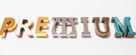
Applelec’s Premium range offers a wide choice, from oxidised brass to green copper Verdigris, for customers seeking built-up metal lettering with a distressed or aged patina look
Armitage also remarks: “For customers wanting built-up metal lettering with a distressed look or aged patina, Premium range (somewhat ironically titled in this case) can help achieve a specific style of decay. From oxidised brass to green copper Verdigris, the Premium Metal letter range takes the guess work out of specifying an aged metal look that can be open to wide interpretation.”
Artificially weathered Corten steel was used by ICE Signs for this etched monolith, reflecting the continuing industrial theme where distressed finishes are currently trending
At the other end of the design spectrum, minimalism is another big trend that Applelec is seeing influencing signage choices—particularly for exclusive boutiques or bars and commercial buildings such as high-end offices. “Here signage seems to do the opposite of what it is traditionally there to do, which is to be clear and noticeable,”
Armitage notes, then adding: “We’ve seen very discreet signage that appears to only be there for those who already know about a particular fashionable boutique or elite bar—or to help create the impression that the bar is elite.”
We’ve seen very discreet signage that appears to only be there for those who already know about a particular fashionable boutique or elite bar”
Such signage includes fascia panels stencil cut with small backlit lettering and lettering appearing on a fascia panel the same colour or material as the lettering. This trend is reinforced in internal signage, such as in a recent project with Logic CP for the offices at Two Pancras Square, where Applelec supplied built-up letters for a black granite reception desk that would have been virtually invisible without the subtle illumination to the rear half of each letter.
This particular effect was achieved with acrylic embedded LED letters from Applelec’s Luxury Acrylic letter range.
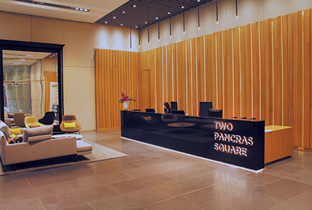
The discreet minimalist trend is also demonstrated in internal signage, such as this black granite reception desk at Two Pancras Square
Fashion is evidently as much at play in sign-making as in other market sectors, demanding the creation of signage that reflects its ever changing trends and entices the early adopters and trail-blazers. Sign-makers who want to keep ahead of the game, therefore, need to keep a keen eye on future predictions.
Your text here...

