
Using the right profile will ensure the amount of ink your printer can use is limited, so you do not end up with black prints that never dry
Having delved into the world of colour last month, this second part in the series will unveil another practical dimension to colour that you can easily apply to your day-to-day situation, as well as how our perception of colour has changed.
Modern eyes are attuned to razor-sharp resolution and colour that errs to the vivid chunk of the visible spectrum. Yesterday’s TVs and the previous generation of mobile phones now look decidedly dated. Tastes in print seem to have moved accordingly. To an extent, it is subject dependent, but retina-scorching colour and unfeasibly sharp detail do, to a very significant extent, define lay views as to what is good colour.
Hitting those deeply saturated and so-called ‘poppy’ colours is something that anyone with a good printer, the right ink, and the right media can do. Anything less than this critical trinity will deliver results deficient in some area or other. You, on the other hand save, literally, pennies per square metre.
Pop of colour
Assuming a well maintained printer loaded with the good stuff in terms of media and ink, poppy colours happen when you get a lot of ink down and are able to dry it while maintaining a good level of gloss—not hard with the right media. To excuse you from the technically demanding job of optimising your printed ink levels and other factors bearing on quality, you get that expertise bound up and delivered in something called a ‘profile’.
A well-cut profile binding printer ink and media together is a joy to use and the results a joy to behold. A ‘wrong-un’ pushes you, your business, and its customers into a real forest of thorns. Whoever makes the media you use will have a selection of profiles available for you. It should come as no surprise that those media manufacturers whose brands are known and respected do tend to have the best profiles too. Those who are less engaged probably use someone else’s and hope that quality and luck intersect at some point for someone. “It could be you,” which is another way of saying—it probably is not. Turn to quality.
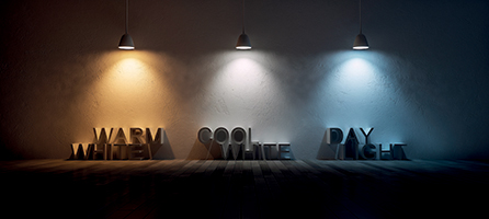
Colourless light is not really colourless at all, for example, white can have a warm or cool tone
Profiles perform a bit of internal magic which limits the amount of ink your printer can put down. This is essential. Your printer is capable of printing, for example, a patch of pure cyan ink to a density it thinks of as 100 percent. In fact, its notion of 100 percent will deliver a patch that has so much ink that it comes out looking black and
will never dry. For practical purposes and within the scope of this article, you have no need for colour that is much outside the conventional gamut. Use the right profile and you do not have to worry about this.

Profiles perform a bit of internal magic which limits the amount of ink your printer can put down. This is essential ”
Use the right profile and you do not have to worry about colour calibration much either. A long list of interrelated factors influences the way your printer’s ink and chosen media render colour. During the profiling process, the person doing the job will print a test pattern containing a lot of individual patches of colour. One of them will be, for example, red.
Most printers do not have red ink. Red then has to be made from the colours the printer has available. If your RIP directs your printers to print red, it will be composed of magenta and yellow ink. Magenta and yellow printed together at the limited 100 percent directed by the profile will result in a simple red, and, by the way, 200 percent ink coverage. See how important it is to use media with a good appetite for ink?
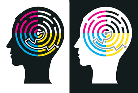
Colour’s inner workings are complex and they all interplay
It may well be that, in getting to other shades and other colours, your media has a tendency by design to hang on to printed dots and the media itself may not be as white as driven snow, again by design. In such cases the colour will not come out as expected. Or rather it will, because the profile directs the set-up to compensate for the conditions it finds.
Profiles are typically cut for one RIP, one media, one ink, one printer and one range of settings. Some drift can happen within the set, some printers vary, and things also change over time. Printers of Flying Monk’s calibre perform routine recalibration on profiles effectively rebuilding them to effect subtle adjustment and keep things in very precise tune. For the record, Flying Monk also cuts its own profiles and does a brilliant job of it squeezing more performance out of hardware and materials than it could otherwise get in the shops.
With the right profile arbitrating over the subtleties, you can with your very own inkjet printer and quality media, push buttons, and get drop-dead gorgeous results with that desirable thermo-nuclear exaggerated colour-space, gloss so deep you could swim in it and eagle-eye resolution. Stand anyone in front of such a print and they will be blown away with it.
It is a galling moment when, and perhaps for the first time, you hear from your customer words along the lines of ‘that is nothing like our green’. It is at this point you have to forget the surrounding content and the general lift that gorgeous images give print in general and think instead of hitting colours accurately or, more to the point, learning from Flying Monk and its experience, satisfactorily.
Some spot colours are easy to hit as we have established. We also agree that some are hard. It is time to understand that some spot colours are impossible to hit with a four colour printer. Some printers have more colours aboard than this notional four colour model that keeps popping up. Unless you can find things labelled ‘orange’, ‘green’, or ‘blue’, the additional colours your printer may sport will not do much or anything to expand the deliverable gamut of your hardware and therefore will not bring additional colours within reach. Light Cyan and Light Magenta are there to achieve smooth colour-space transitions or ‘gradation’ they do not give you more colours per se.
Thankfully most designers have a practical bearing and come up with corporate ID that is within the compass of the four-colour model. On that basis you can land on the right colour or something that pleases. If you are not bristling with the sort of colour-tools within hands reach at Flying Monk, you can turn to other tools that do not just keep you in the fight, they help you win it too.
Hit the right shade
Roland DG, Clevedon-based manufacturer of Roland inkjet printers and of some superb ink-sets, has such a tool and it is very neatly packaged. The Roland Colour System enables anyone equipped with a Roland inkjet printer to produce an excellent colour communication tool and use it to manage client expectations and colour in a more general sense. Similar methodologies are applied by others.
The Roland Colour System is implemented in the company’s highly regarded VersaWorks RIP and helps close what might otherwise be an open circuit in easily accessed colour management. What the system does centre around is the creation of a management and communication tool that reflects in absolute terms the output of the user’s own printer and the very media he or she uses.
O Factoid: Most printers do not have red ink. Red is made from the colours the printer has available, therefore, if your RIP directs your printers to print red, it will be composed of magenta and yellow ink. O
Using the tools provided within the system, the user can print a very generously dimensioned swatch using the media he or she works with. There is a bit of hands-on labour involved in turning the flat-plan printed output into the finished swatch but the time invested will deliver its rewards at the first use. Once printed and assembled, the swatch can be used to determine a target colour by comparing the reference original with the printed matter in the swatch with the naked eye.
Colour differences or the distance between two colours is typically expressed in colour management circles as a single number known, just a little confusingly, as Delta-E. Theory holds (and reality sometimes confounds) that the smallest appreciable difference between two colours is a Delta-E of 1.0. In practice, a difference that small is practically imperceptible and if you find yourself driven by someone with such standards, you are going to have an exciting ride.
The Roland Colour System does not have the benefit of a sensor capable of slicing Delta-E 1.0 any smaller than that, it is using the eye after all, it does more than get your match in the ballpark though—it reliably nails it to broadly acceptable tolerances. An added bonus is it is beautifully intuitive to use.
In addition to serving as a means to match, the Roland Colour System is a powerful colour communication tool. It can be used to secure client agreement that a close match is close enough before time and money is wasted proving a close match is not what is needed. The format is familiar and comfortable to those who are not at all acquainted with colour. It is a swatch and works, in the eyes of most on the client side, just the same way a paint swatch might.
Securing the colour specification with Roland’s swatch and dialling the numbers into the design side effectively heads off at the pass of one of the biggest opportunities for error in the whole colour operating environment. The end user gets to see colour rendered in the right colour-space model, on the very media that delivers his output and produced using the very printer that will actually make it.
A lot can happen to colour on its way from the RGB device that designed it into print
Managing colour in this way does not impose a big technical overhead on the print producer and yet radiates confidence and capability to the end user. On that basis it has to be assumed that the Roland Colour System supports the sale of printed output in addition to its role as a communication and colour management tool.
Signs and graphics shoulder a much greater responsibility for colour fidelity than other media. Coca Cola, for example, has absolutely no control whatever as to how its famous red is rendered in television advertising or even where it appears on the internet. The closer promotion moves to the point of sale though, the more critical the need for appropriately rendered colour becomes. Packaging arguably is the most critical and the most critically controlled. Point of sale fixtures, posters, and signs line up behind that.
Managing colour in context rather than managing colour for its own sake is the imperative. With tools like Roland’s Colour System making it possible to communicate and hit matches in precise terms and quality media like the MD-Class offering from Metamark available, colour can be managed and managed well. Most sign and closely allied applications accept colour within manageable limits.
Colour unfortunately begins to decay the moment it is printed. There are lots of modes of failure to which print may be subjected. Many can be avoided by using the right ink and media in a well maintained printer and a stable operating environment. Even the best print though is going to die eventually.
Print often becomes troublesome when something that has seen a few summer’s turns up and can be compared directly with something that has not. Give thanks that it is not easily possible to see two sides of a van at the same time. It is likely one is more weathered and it will look different. We are back to the question of media and ink when it comes to turning out good colour and extending your customer an assurance about its staying power though.
If media and ink seem to be getting a lot of attention here, it is because they are no less than pivotal. It must be understood therefore that changing either, unless it is for the better and supplied with the needed support, has the capacity to damage you. New ink demands new profiles and updating all your colour references. Change by all means—but only for what you know to be a superior offering.
If we look at exemplary colour management as practiced by Flying Monk under the expert eye of Shaun Gath, it does not take a practiced colour scientist to realise that those spot-on results are a reflection of an attitude in a general sense that happens to focus on colour. They actually do care. They care enough to apply colour critical operating methodologies across everything they do. If a piece of colour print leaves the premises that is not colour critical by definition, the company’s operations are such that it can be exactly reproduced if it is needed again in the future.
For those of us looking to competently handle colour without getting sucked into a deeply technical workload, working practices can be applied. It looks something like this in summary.
Get it together
First. Communicate colour clearly. When the need is for something that is not pleasing for its own sake but critical in nature, communicate in the correct colour space. Submit output that actually reflects what you can produce. You should proof on the printer and on the media you will use ideally. A proof produced on an A4 desktop printer is not a proof of a few things but it might struggle with colour.
Second. Get the artwork and colour specification right. Most problems with colour trace to the artwork and design generation. As you move further up the pyramid of cause in colour issue, the more sophisticated the tools become. You will sort more problems out in the artwork than anywhere else.
Third. Work with premium inks and quality media for the consistency, for the support that is delivered as standard and for the measurable improvements in colour performance you will get. Compromise here and you will be saving pennies per square metre and you should question the worth of doing that.
Your text here...

