
Colour is massively subjective and heavily nuanced by a number of complexly interlinked factors
The problem with colour is, you do not have to look into it too deeply before the complexity of the subject bares its Pantone yellow teeth and devours any ambition you might have to learn its inner mysteries.
Wherever you look, you do not have to venture too far into the subject before it seems to lose its relevance to the practical problems you have to solve day-to-day, and the subject veers off at an academic or scientific tangent. This feature does not do that. Follow it to the last sentence and then stay tuned for part two in the November issue of SignLink, and you may discover a practical dimension to colour that you can easily apply to your day-to-day situation. You may come out of the end of this feature series just a little better equipped to deal with colour and that may make a big difference to you and your customers. But, why bother?
When colour goes right, and it may for you, the pervading feeling is, ‘what is all the fuss about?’ When colour goes wrong, you find yourself in the midst of a toxic brew where there are just too many knobs to press and none seem to advance the case.
Evaluating colour
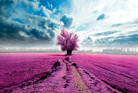
At its very simplest level, there are few people who are not capable of making elementary assessments about printed output and its colour quality. Subject matter helps. Skies, unless they are brutally edited for dramatic effect, do tend be rendered in some shade or other of blue. Skin tones represent another easily assessed group of colours that tend to look, intuitively, right or wrong. Grass is green. A bus is often red. That Shell garage across the road is dominantly yellow. That is about as simple as the subject gets. That said, white is actually very rarely white and neither is the apparently colourless light all around us actually colourless.
That sky you have just printed, it should be ‘blue’. Instead though, you have produced something that is blue, but not quite. It seems to have a blush of pink about it, particularly where there is a bit of cloud that ought to be white. What is happening? You would not be the first person looking for answers to pick up a magnifying glass and have a really close peep. You will not be the last either. Looking closer though tells you nothing.
Colour that strays beyond conventional is easily identified
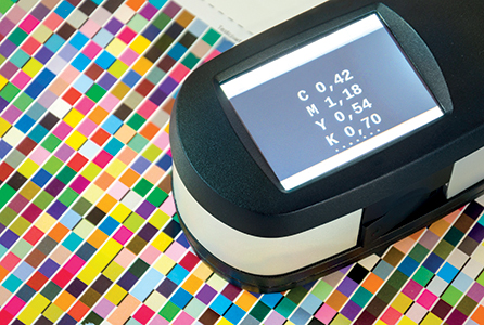
Through the glass you see an inexplicable mush of variously coloured dots and smudges. Unless you are deeply versed in the subject, colour’s forensic fingerprints on your media do little to disclose what is going on. Chances are, you are going to tweak something and print again—so doubling your bill of materials for that particular job and consequently eroding your profit in a pretty significant way. Correcting obvious colour problems on an experimental or empirical basis is costly. Let us have another look at that print.
A pinkish blush? Look at the whole print and not just the obvious bit and what you may discover is that the blush is present everywhere, to whatever extent the underlying colour allows you to see it. It is not just in the clouds, it is in other bits of white detail too. And it seems to be throwing the blues and other known colours off as well. Chances are, your print has a so called ‘magenta cast’. ‘Casts’ come in many colours and they are generally uniform. If you wind back the magenta, chances are that your print will just spring to life. Compare your adjusted reprint and you will be amazed at the difference.
If there is a face staring out of your sky-laden print, you will be amazed what winding down the magenta does to it too. Suddenly the healthy complexion has vanished and it replaced by a jaundiced and flat looking specimen. Indicated action? Get to know colour just a little better and correct its issues at the source.
An expert eye
Colour is massively subjective. It is also very heavily nuanced by a bewildering number of complexly interlinked factors. Some applications for printed colour are much more critical of the results you produce than others. So are the clients who order them.
Flying Monk Graphics is based in Malmesbury and run by Shaun Gath and his team. Gath is a respected authority on the subject of colour, but can also claim many years managing its practical dimensions too. He knows inkjet print technology from its DNA upward and is capable of squeezing from it results that are truly world class. They have to be. Flying Monk goes about its business very quietly and keeps some very particular blue-chips coming back for more. He takes care of a large number of trade clients too. When it comes to colour, Gath is worth listening too.
Great media has a good appetite for ink—more ink, more colour
Colour has the capacity to undo even the most expert, as Gath is happy to admit. He outlines a situation in which colour recently got the better of Flying Monk, an exemplar among experts.
He says: “We’d been asked to produce some printed matter for a large consumer electronics brand, it was to be used in a shop around a product launch. We went off and did our due-diligence, found the company’s colour standards and began the art-working phase of production. When we delivered the first prints for evaluation to the venue though they were rejected. In the midst of all the other colour around in the cause of promotion, ours was right, but it looked wrong. We needed to get it into line, and pretty quickly, so we used surrounding painted matter as a reference and our next prints looked spot-on. Not bad for a job that wasn’t right!”
Gath makes a key point. Colour is a dynamic subject, that is to say it drifts around a bit.
Getting it right means introducing stability into the equation. Having a process that is scalable and reproducible is what matters. It is well within grasp. Gath is a very committed advocate for getting the artwork right. If you start with the wrong basis, for example, a customer gives you target colours he is determined from an RGB colour device such as a monitor, you would better get the colours agreed by first showing your client what the output looks like when it has been through the journey to a CMYK printer, such as the inkjet printer you operate.
O Factoid: Lc and Lm inks are not there to extend gamut, they improve gradation. O
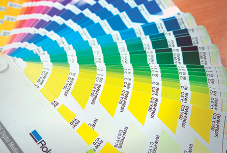
Customers are typically going to be looking to closely match known spot colours or for acceptable four-colour prints. Spot colours can be easy to hit. Spot colours can be hard to hit. Spot colours can also be impossible to hit. It is here we need to consider a bit of colour jargon. Gath talks in terms of ‘gamut’.
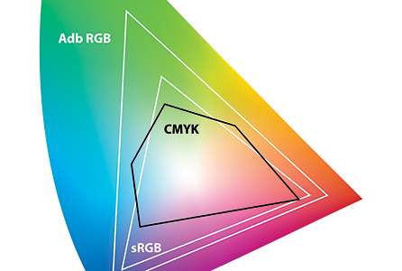
Gamut is simply the extent of the colour a given device can produce or display
“Gamut is not a difficult concept to understand,” he says, adding: “Gamut relates typically to a device, such as a printer, it’s the sum total or extent of all the colours it can reproduce in a practical sense. Colours you can’t see of little use. Colours you can’t dry are troublesome. If you’re printing with a well maintained machine you can consider its gamut in just those terms. It’s all the colours you can reproduce.”

Gamut relates typically to a device, such as a printer, it’s the sum total or extent of all the colours it can reproduce in a practical sense”
Flying Monk takes care of every aspect of its colour management in-house. A consequence of this, and of Gath and the team’s expertise is, the printers that they operate are able to demonstrate a wider gamut than other comparable or even identical devices. This helps the company nuance its colour and deliver those jaw-dropping, class-leading results.
Media does better
One of the biggest limiting factors that influences colour is the very media you print upon. Seen through a colour critical eye, not all media are created equal. Metamark’s MD-Class media are used as colour reference stocks by many printer manufacturers. This is the same media you can buy and its known as having a very generous gamut by design.
Metamark’s Ian Simister elaborates: “We put a great deal of emphasis in designing materials that liberate the maximum available gamut from the print hardware they’re used it. What that means is designing the media so they have a very good appetite for ink. The more ink you can get down and deal with, the more expansive the gamut from the printer. We hit 100 percent CMYK with a lot of headroom to spare. Prints dry readily, definition holds reliably, our media is consequently very easy to use.
Ink is the source of all the colour you can reproduce. Turn to quality media and print technology to get it right
He adds: “We’ve taken the science a little further. We aim to produce media with broadly balance gamut and capability. Many of our customers used mixed Metamark media in a single job and get consistently good results.
The implication may not be obvious but it’s this. Our media is so highly developed that you don’t need to go rushing off out of habit and use what’s now become, by comparison, very expensive traditional media just to get good colour and longevity. We’re delivering that across a whole range of media that’s appropriate for the job in hand.”
In chasing great looking and consistent colour, media is a very good place to start. It represents, or should, a relatively stable anchor to which colour can chain itself. Properly manufactured and branded, what comes out of the box is likely to perform well over time and across batches. Chasing great colour across an ever changing media landscape, printing on the media-de-jour, is only ever going to frustrate efforts in producing consistent or satisfactory colour.
Maintain me
Print hardware, unfortunately, is not quite the stable platform media ought to be. Factors too numerous to discuss in a few pages have a big influence on colours. What we can do though is underscore the value of attending to the more conspicuous ones. If yours is a story of ‘chasing the sweet spot’, fighting with reliability issues and forever getting unexpected results, maybe your machine is saying, in the only terms it can, ‘maintain me!’.
Maintenance regimes are designed by conservative engineers mindful of the needs of end-users, who are trying to maximise up-time and contain costs. Even so, routine advised maintenance is a must. Keep a machine on the brink of absolute failure and it can drift alarmingly— even in the space of producing one print. Keep it working well and you are rewarded with better colour and generally more reliable operation. The cost of maintenance looks scary when you see the invoice in front of you. Loaded into the square metre cost of all the print you produce though, it is trivial.

Routine maintenance is advised for a reason. It keeps your hardware performing
Think ink. Ink is colour. It really does sustain the life of the machine. It is little different to media in the sense there is plenty of choice out there. Loading a dodgy roll of vinyl has markedly less serious consequences than pouring alien liquids into your new printer though. Again distribute the costs of working with quality inks into output over time and it is trivial compared to the returns it offers.
Ink is the prime contributor to gamut. Working within technical limits, some inks have more extensive or useful gamuts than others. In our world, we work often where what you might call ‘advertisers’ colours’ are prized. Good quality inks get you there and your printer manufacturer or his dealer will willingly demonstrate how.
Advertisers’ colours are, often, not strictly speaking correct. They are larger than life itself. They are very deeply saturated, display soot-and-whitewash levels of contrast and yet retain a lot of detail across the whole range of the print. In striving for better colour, lots of print practitioners end up producing advertisers’ colours and also end up with very happy customers. Our subject has just strayed somewhat into the subjective. On that note, I will end this feature, but stay tuned for part two to hear from Roland DG and my concluding top tips.
Your text here...

